
Mobile Design For The Modern Business
 Author: fjleto
 Date: February 8, 2015
 Mobile Design For The Modern Business
If you think that mobile will become important in the future, you would be wrong. Mobile is important now as it accounts for 35 percent of total organic traffic to websites with that number expected to grow year over year.
On paper, this might not seem like a significant amount, but consider this: nine out of ten searches result in some kind of action whether it’s making a purchase or visiting a business.
Unfortunately, mobile consumers also have little patience as 61 percent of users will quickly move on to another site if they cannot find what they need.
Worse yet, visitors will leave with a negative impression of your brand and likely won’t return. So how do you optimize for mobile?
Focus on Local
It should come as no surprise that the majority of searches on mobile have local intent.
People tend to use their phones when they are out and about and need information immediately, whether it’s a for food or car repairs. Because so many people perform local searches, Google has actually modified their mobile algorithm to rank businesses that are local to the user higher than those that are not.
Not only can this boost traffic to your site, it can also boost your revenue as 88 percent of users that perform these local searches take action within a day.
Besides listing your contact information on your site, you can improve your local presence by doing the following:
- Add your address and phone number on your social profiles.
- List your business information in directories such as Yelp, Google My Business and TripAdvisor.
- Ensure your contact information is consistent across the different directories.
Have a Good Design
While mobile devices have replaced the traditional PC in many ways, there are still some limitations. Most notably is the smaller screen size.
This affects every aspect of your site from the navigation to the content on your screen. More specifically, users are looking for:
- Information that they can access in one to two clicks
- An easy to use and find search bar
- A site that fits completely on a small screen
- Large navigation buttons
- A “click to contact” button
- Fast load times
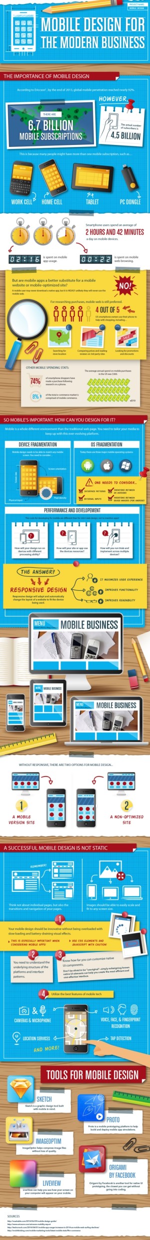
While many brands have opted for the separate mobile site, this requires more maintenance as it is not connected with the main site.
If you don’t have that kind of time or manpower, the best route to take is responsive design.
Unlike a traditional site, responsive sites scale to fit different screen sizes. And since you’re not creating an entirely new site, you save yourself time as changes will appear on both desktop and mobile devices.
Better yet, Google will rank your site higher in mobile searches if you use responsive design over other options. T
he infographic below will provide you with more information on the benefits of responsive sites and tools to help you design for mobile.
Download Our First Free eBook!